Session 09: Refining the System: Analysis
Hey there. Welcome to this session of the Online Notes project for Cryptiquest, LLC. So far, we’ve done all the Pre-Production and the main portion of Production. This session will focus on refinement, specifically analyzing the site and what needs updating.
For this session, screenshots will be captured to show what the site looked like as (hopefully?) the site will look different by the time you even read this.
To analyze the site, I’m going to look at a few test pages: home page (which is just a listing page), posted article, and the “All Project Deliverables” page. I’m also going to look at them in both desktop and mobile formats. So, here goes.
The Home Page
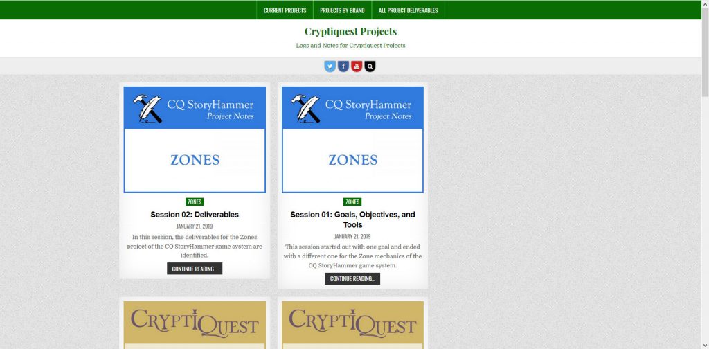
The most striking thing about the home page on desktop is the imbalanced margins on either side of the page. I believe it is set up to allow for a right widget but I cannot find a way to manually deactivate this using the theme. No big deal, I can do that on the back end.
The second thing I notice is that the articles have different heights when in the same row. I think this could be adjusted with styles so that shorter ones automatically stretch the white background to level the containers but this might result in a worse use of the negative space than just leaving it.
The third thing I notice is I really hate the colors and style – it looks like a golf website. I wanted to use a color that didn’t hadn’t been used for another Cryptiquest site or brand and I chose green but it I hate it. I have to determine what the personality of the site should be then choose colors and fonts to reflect that personality. I may need to design a logo for this, despite this not being a brand. Maybe this would be as simple as adding the word “Projects” to the Cryptiquest logo?
Also, while the site name leads to the home page and it’s smack in the middle of the top of the page, it still don’t think it is intuitive enough to serve as the only navigation element that brings the user home. Even I have had to think for a second or two about where to go to get to home and I built the darn thing. I think the name should be in the main navigation, to the left. This will also open up more real estate to posts and content.
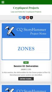
For the most part, the mobile version of the home page seems okay. Here, the title-being-the-only-navigation-element-to-take-the-user-home issue is even more of a problem since the instinct for the user is to click the mobile menu to bounce around the site.
Otherwise, the site looks pretty sharp on mobile, despite the golf club feel.
Posted Article
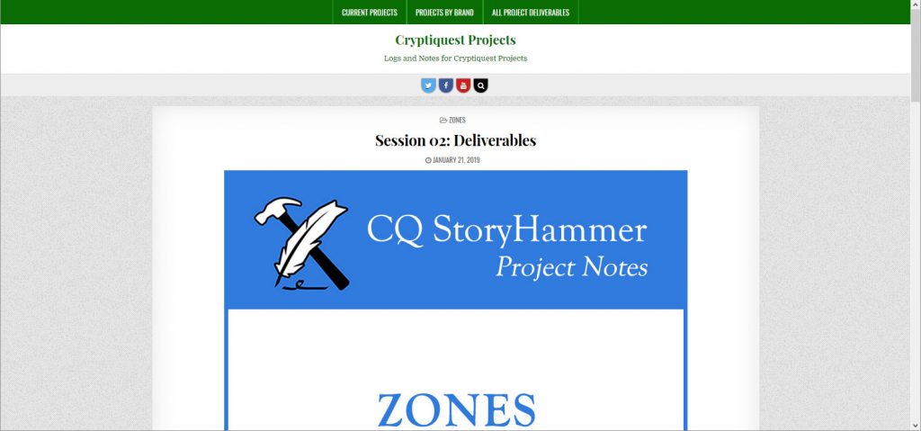
This is not good. The image is gigantic. I think the image is important as it immediately tells the user that they are in the right project but it should be much smaller and inline with the text. Below this giant image, readability goes out the window:
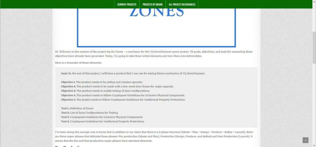
The font is light and tiny. It’s so hard to read and the sentence widths go on forever. This will definitely need to be remedied.
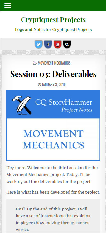
The posted article doesn’t look a bad on mobile and perhaps what happened was that the developers of this theme designed for mobile and abandoned desktop formatting.
Still, the body copy could do with some enlarging and I’m not crazy about the title font, not that I look at it. But that will change once I look at establishing a personality for the site.
All Project Deliverables page
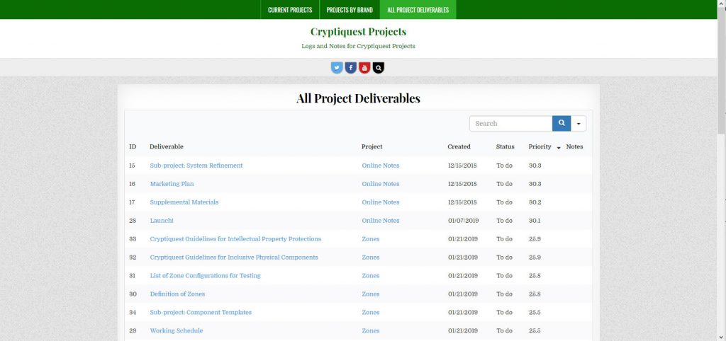
This doesn’t look too bad. I actually use this one myself for project management purposes. There are some things that need to be changed or added.
I’ve decided that I would like a “Completed” column after all, so that needs to happen. And I think I’d like a “Labor” column to reflect how much time is either estimated or had actually been spent on the task.
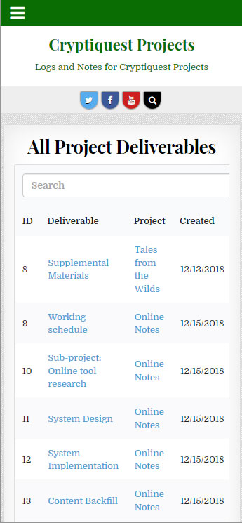
On mobile, the Deliverables page isn’t bad. It’s navigable, it’s easy to read, and the sort functionality works. I don’t see any reason to change anything based on the way this page looks or behaves in mobile.
Footer

The date is wrong. I need to make the date dynamic so it reflects the current year.
For all my other Cryptiquest sites, I have the copyright copy on the same line as the contact/legal links and I think I would like that here, too.
Conclusion
Here is the final list of changes:
- Fix listing pages to remove right column allotment
- Try to make article heights dynamically uniform per row
- Develop a style guide for the site
- Create a logo for the site
- Add the home page to the main navigation
- Format size and position of the image on article pages
- Format size of copy on article pges
- Add “Completed” column to All Project Deliverables page
- Add “Labor” column to All Project Deliverables page
- Add dynamic date functionality to footer
- Place all Footer content on same line
The next step is to make these changes. The next session will probably explain what I did and reveal the results in screenshot form (as the site may change again after this project is completed).